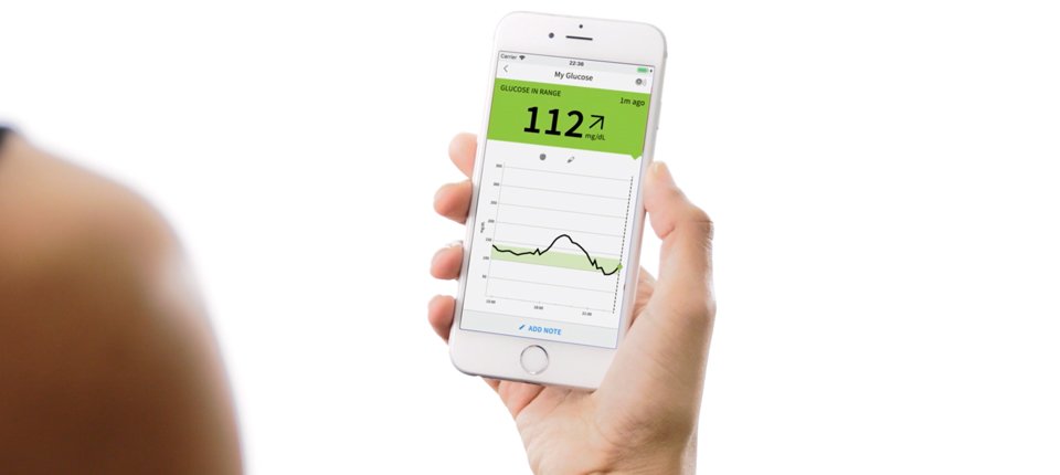
Freestyle LibreLink App
The FreeStyle Libre Glucose Monitoring system is a continuous glucose monitoring (CGM) device indicated for replacing blood glucose testing and detecting trends and tracking patterns aiding in the detection of episodes of hyperglycemia and hypoglycemia. It helps by facilitating both acute and long-term therapy adjustments in persons or pets with diabetes.
For this project, I wanted to evaluate and propose better writing solutions for the Librelink app as it relates to checking glucose levels in diabetic pets.
Probelm
As a new diabetic pet caregiver, I need to consistently monitor my pet’s glucose levels. Accurate glucose readings are a necessity for managing my pet’s health and administering the proper doses of insulin daily. Currently, how the app is presented there are numerous areas throughout the experience that make it harder to understand the information needed to properly manage my pet’s well-being. I’m going to try to fix these.
Person
Below is the affected user persona that would be impacted the most.
Area of focus
Two areas I chose to focus on were the “Welcome” flow and “Change Sensor” flow.
Welcome Flow
Change Sensor
change sensor flow
Changing Freestyle Libre glucose sensors is a regular, routine, part of any diabetic person or animal. Sensors have a limited shelf life of about 14 days and should be scanned throughout the day to view and document glucose levels. The flow below illustrates the current process of in and out of the Librelink app that goes into replacing a sensor.
Existing Narrative Arc
Here is what the existing Narrative arc looks like for a user for the Change Sensor flow.
Exposition: The story begins with the user scanning the sensor only to see that it needs to be replaced.
Inciting incident: Users must physically remove the sensor and physically reapply the new sensor.
Rising action: User scans new sensor to link to the Libre app.
Crisis: The user is informed that they must wait 60 min. before rescanning to be able to use the sensor and receive glucose readings.
Climax: User waits the 60 min. and proceeds to scan the sensor to receive glucose readings.
Falling action: The user analyzes and makes decisions based on glucose readings such as food levels and insulin levels at the time of reading.
Resolution: The user’s pet receives appropriate diabetic care.
Proposed Narrative Arc
Here is my new proposed Narrative arc.
Exposition: The story begins with the user scanning the sensor only to see that it needs to be replaced.
Inciting incident: Users must physically remove sensor and physical reapply new sensor.
Rising action: User see app notification to sync new sensor Libre link app.
Crisis: User sees message that they must wait 60min after scanning, but with a count down to let them know how much time has lapsed.
Climax: 60mins pass the app supplies a notification letting the user know they can scan their pet’s new sensor to get a glucose reading.
Falling action: User makes analyzes and makes decisions based on glucose reading such as food levels and insulin levels at time of reading.
Resolution: User’s pet receives appropriate diabetic care.
Journey Mapping
I mapped the user’s current journey through the change sensor flow and found numerous areas of improvement.
Adjustments and Improvements
I worked on removing ambiguous text and unclear messaging from alert and modal screens. These need to be as direct as possible and often lead to confusion on how to properly move forward when a sensor needed to be changed and a newly applied sensor synced.
Adjusting Home Dashboard
Next, I worked on making the home dashboard more useful. I surfaced most recent “Time” and “Glucose” readings in the top metrics area, adjusted the bottom “Time remaining” meter to effectively change color when days remaining become lower while adjusting text to be more direct, and added a touch target to the graph to allow for interactivity. This way when a user taps and holds on the graph a tool tip will appear with glucose reading data.
Being More Transparent
Something that needed to change was the ability to see a timer when scanning and activating a new sensor. Currently the app asks users to wait 60 mins but doesn’t provide a count down or a specific time for the sensor can be scanned regularly. Also once scanned the “My Glucose” screen can often present varying icons that do not have contextual help to remind the user of their purpose. So I added tool tips with reminders of what the different icons means to help the user understand how effective treat there diabetic pet.
Welcome Flow
This is the welcome flow that every user walks through when they create their account for the first time. Here the user is exposed to some of the most important cues and hints that will appear later in the app that will help the user understand glucose readings and administer medication.
Areas of Focus
There were a few screens here where I made strides to make more concise labels and adjust the description text to be more direct. This included adding medical terminology to help users understand the trend arrows, also adding a tooltip on the “Treatment Decisions” screen to let the user know that the functionality existed. I also reworked the description text of the “Treatment Decisions” screen to be more direct.


