Widgets App
Widgets is an online wholesale retail app for buying home improvement goods. I was able to evaluate the app and improve copy across multiple screens and instances giving the app a more updated tone and voice.
Goals
Evaluate the current experience and provide an updated copy and content for confusing UX writing and other usability issues.
Work
Item details
The Item Details screen had a number of string issues and was missing important content that any product page should have.
Items adjusted for the details screen:
A product description would be nice to have - Some product specs as well, weight, length. Reviews could alo be added.
Add stock amount
Add FAQs
Shipping Details
Added items usually bought with this item
Price Comparison
The Price Comparison drawer presented some usability and accessibility issues. When the drawer opened it did not provide a way for the user to dismiss. I added a “Close” Link button to the top right-hand corner of drawer matching the tertiary button styles.
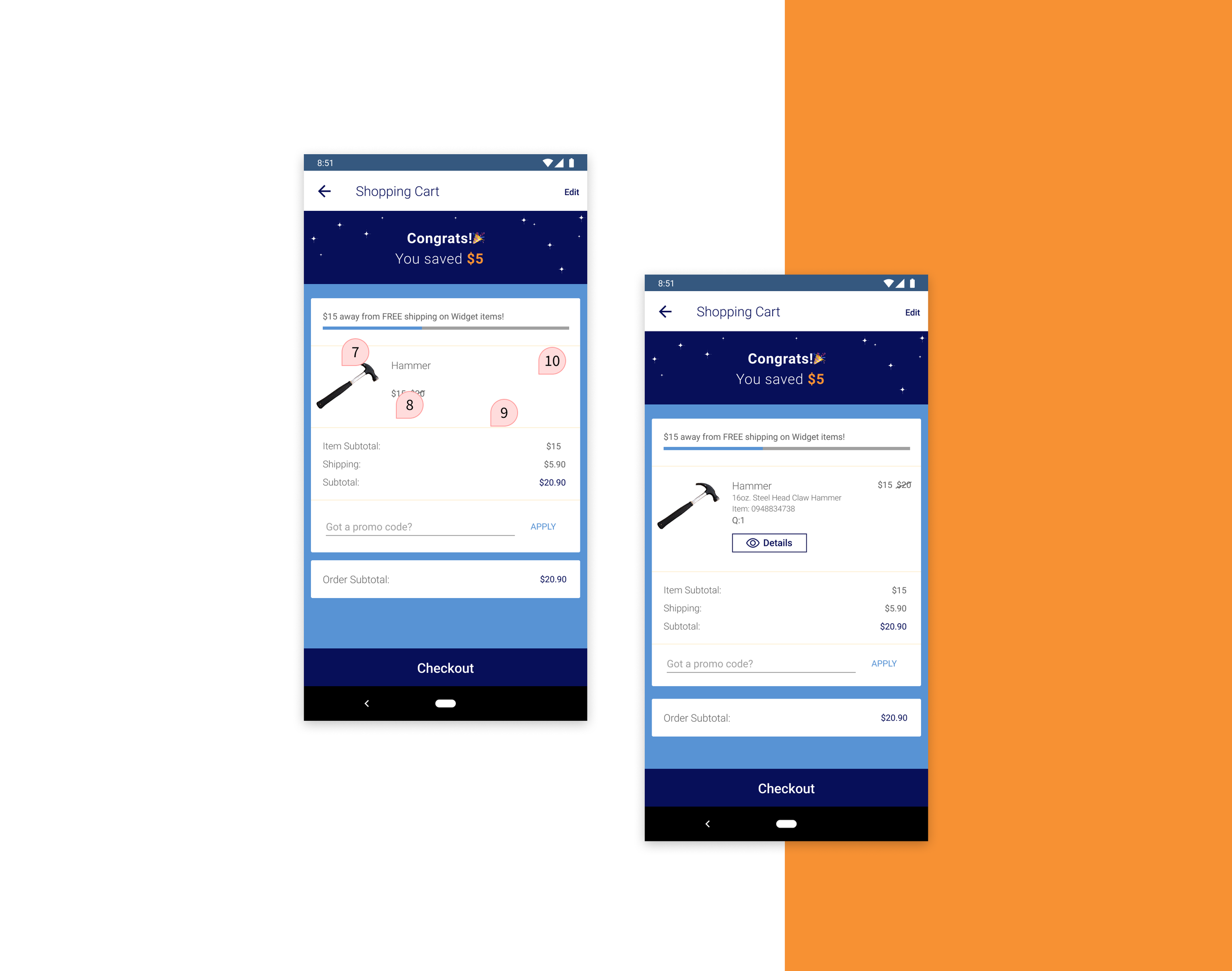
Shopping Cart
There were a number of essential UI elements needed for the shopping cart screen. The current implementation lacked important information and data like the quantity of items that were added and item/skew numbers of the product. I added these to the design while also including a short description of the product and quick view button option that would present a modal to provide the user with more information about the product.
Address
The address form was also missing a few important pieces of UI. I was able to add in the “Use as Billing Address” option for ease of use for the user and also include the “Apartment, Suite” option for a more inclusive design.
The shipping address screens had issues with the error validation messaging not being clear or concise and I was able to add a “Text Order updates” option.
Credit Card
For the Credit card information screens, I added the hide/show option to provide the user more privacy when filling out the form.
Purchase
Lastly, on the purchase confirmation screens, I adjusted labels to be more in line with the task at hand and adjusted the Primary CTA label to be more direct. For the final confirmation screen, I also included text like the item number, product short description, and quantity purchased.


